Saturday, April 25, 2009
Senior Project Pieces
Slime Mold Necklace
14 k gold plated copper
Slime Mold Post Earrings
14 k gold plated copper
Slime Mold Dangle Earrings
14 k gold plated copper
Slime Mold Cuff Bracelet
14 k gold plated copper
Slime Mold Cuff Bracelet
14 k gold plated copper
Slime Mold Brooch
copper
on the body:
Monday, February 16, 2009
Taher Chemirik
Proposal for Senior Project
"The Beauty Slime Mold Can Hold"
SUBJECT:
The mind is a maker of analogies, a suppliers of metaphors. It is a distributor of associations with a brain full of symbols waiting to be shipped out. Some objects like apples or roses have strong and traditional emotional associations with temptation and love. Other objects like shoes have weaker, less obvious associations. Associations arise from colors too. Green is healthy. Red is aggressive. Associations ultimately depend on context. An apple on a teacher's desk means something entirely different to most of us that the proverbial apple offered by Eve to Adam. Associations can arouse strong emotions.
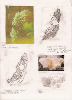
This whole subject of associations and the emotions attached to them came to the forefront of my attentions when I found myself strongly attracted to images of slime mold I discovered on the internet, in my search for natural objects as the basis for organic jewelry. I wondered why and how I could find these pictures so artistically striking when they were photographs of slimy mold. So I did some quick research on slime mold in an attempt to understand it more fully.
Slime mold may have an unattractive name, but it is unfairly demonized by it's name. These fungi-like amoeba organisms can appear gelatinous in some stages of their growth, hence their name. But they are not fungi. They are really oddballs or misfits in the biological hierarchy. They are close to being both plant and animal, but are neither. Slime mold has been the inspiration for many "B' grade monster movies. But ironically, slime mold for the most part, is a beneficial organism that decays dead plant material, returning nutrients to the soil.
So why does slime mold inspire me to formally reproduce its various forms as works of art? The answer is simple - it is hard not to be shocked by its stunning beauty of color, form and texture in all of its life cycle stages. It remains an unexplained contradiction to me. The images of decay and horror that slime mold is traditionally associated with versus the reality of slime mold actively enriching the earth while growing in gorgeous colors, textures and forms. Conceptually, my organic jewelry comes from a desire to embrace the impermanence of the natural world around me. Rather than mourning the transience of life, this jewelry will celebrate it, transforming decay into beauty, slime into the sublime. Practically, these slime mold designs are aesthetically pleasing. They alternately can resemble coral, leaves, branches, veins, pearls - a myriad of organic forms. It is almost as if the design is alive, showing growth and movement in its branching form.
As an artist, I realize that the association I make with an object may not be made my others. By lifting out a small segment of one piece of a specific slime mold and reproducing it in metal, I can refocus the viewpoint and hence the association. Not showing the whole subject shifts from the information and emotion associated with the whole, to something more abstract. Parts can be graphic. When designs are not literal, they invite many interpretations. By focusing on a part of the slime mold design and lifting it out of its usual decaying context, I hope to invite the viewer to appreciate the beauty of things previously overlooked, to revive a part of our world previously dead to our senses.
OBJECT:
I propose to make a few pairs of earrings and a few necklaces, maybe a bracelet and a ring - all with the purpose of bringing natural forms to the human body for display, adornment and enjoyment.
Using the format of jewelry, I hope to reveal some unexpected and hidden beauty, buried in the contradictions of nature and design.
senior project ideas...
I decided I want to electroform hot glue forms based on slime mold for my senior project and then enamel them. I want to make a whole line of slime mold jewelry - necklaces, earrings, rings, bracelets, etc. Since it is fairly easy and fast to make the hot glue forms, I want to make a whole bunch of them to electroform, this way I'll have a lot of pieces in the end.
These pics are some of my hot glue forms that I made on a much smaller scale than my previous ones, and the chain is laid out so that the orientation of each pendant is clear.
Sunday, February 15, 2009
Sketches and Maquettes for Enameling
Saturday, February 14, 2009
Photographs of my Jewelry
For my senior project, I was required to have some of my work professionally photographed, and then send the images of my work to 3 different exhibitions for the experience and in hope of getting my work entered in one.
I went to Joseph Hyde to get three of my pieces, all inspired by mold, photographed this past friday. He is an amazing photographer and very nice man. He emailed me these jpegs the very next day which was very cool, so here they are!
Joseph Hyde:
http://web.me.com/josephhyde1121/Joseph_Hyde/Contact.html
Websites I Like
Part of my senior project is to locate 5-10 artist's websites that I love, take screen captures of the sites and post them to my blog. The goal is to build an effective online presence - identify what we like in a website so that we can create our own. I chose all jewelers because those are the types of artists whose websites I frequent.
Anthony Nak
Jewelry designers Anthony Camargo and Nak Armstrong launched Anthony Nak. I love the black background, the simple font, the cropped photos of their jewelry, and the use of artsy photographs to showcase some of the jewelry. I think their site is very classy and easy to navigate.
http://www.anthonynak.com/
----------------------------------------------------------------------------------
Alexis Bittar
Inspired by bakelite and Lalique glass and stimulated by the beauty of precious and semiprecious stones, he mixes unusual colors into bold combinations, some of which have become collectible pieces. I like the white background here just as much as I like the black used by Anthony Nak. I don't like colorful backgrounds...I think they take away from what you're trying to showcase. I also like the modern looking font, where the name "Alexis Bittar" is in lowercase letters.
http://alexisbittar.com/home.php
http://www.verbena.net/producthighlights/alexisbittar.htm
----------------------------------------------------------------------------------
Suzanne Wilson Designs
I love Suzanne Wilson's website. It is very simple, yet beautiful. It is also very easy to navigate. I especially love the way her jewelry is displayed on objects found in nature. I think it enhances the organic quality of her work. I'm thinking this might be a good direction for me to head in with my website.
http://www.swdjewelry.com/
----------------------------------------------------------------------------------
Lauren Wimmer BEADS
I like Lauren's website is it very very basic. I don't like complicated websites. In fact when a website is too busy I won't even bother looking at it. This has a nice plain white background, and the jewelry is photographed to that it looks like it's floating in space. I think that is a great way to show off jewelry because there is nothing distracting the viewer.
http://www.laurenwimmer.com/index.htm
----------------------------------------------------------------------------------
Odette
Jennifer Sarkilahti is an artist and designer who created her own collection of jewelry called Odette New York. Since she is inspired by nature, botanical forms, art, and modern design, it makes sense that her jewelry is displayed on rocks, slate, branches and the human form. I love the use of monotone colors - white, light grey and dark grey. It matches the jewelry and what it's photographed on.
http://www.odetteny.com/
----------------------------------------------------------------------------------
Kyoko Honda
What I love about this website is the inclusion of hand drawn and graphic images on the homepage. I also obviously love the white background and the simple font. I also really like the way the thumbnail images of the jewelry before you click on the to blow them up larger are cropped so only part of the piece shows. I think it makes the viewer want to look closer to be able to see the whole piece.
http://www.kyokohonda.com/index.html
Anthony Nak
Jewelry designers Anthony Camargo and Nak Armstrong launched Anthony Nak. I love the black background, the simple font, the cropped photos of their jewelry, and the use of artsy photographs to showcase some of the jewelry. I think their site is very classy and easy to navigate.
http://www.anthonynak.com/
----------------------------------------------------------------------------------
Alexis Bittar
Inspired by bakelite and Lalique glass and stimulated by the beauty of precious and semiprecious stones, he mixes unusual colors into bold combinations, some of which have become collectible pieces. I like the white background here just as much as I like the black used by Anthony Nak. I don't like colorful backgrounds...I think they take away from what you're trying to showcase. I also like the modern looking font, where the name "Alexis Bittar" is in lowercase letters.
http://alexisbittar.com/home.php
http://www.verbena.net/producthighlights/alexisbittar.htm
----------------------------------------------------------------------------------
Suzanne Wilson Designs
I love Suzanne Wilson's website. It is very simple, yet beautiful. It is also very easy to navigate. I especially love the way her jewelry is displayed on objects found in nature. I think it enhances the organic quality of her work. I'm thinking this might be a good direction for me to head in with my website.
http://www.swdjewelry.com/
----------------------------------------------------------------------------------
Lauren Wimmer BEADS
I like Lauren's website is it very very basic. I don't like complicated websites. In fact when a website is too busy I won't even bother looking at it. This has a nice plain white background, and the jewelry is photographed to that it looks like it's floating in space. I think that is a great way to show off jewelry because there is nothing distracting the viewer.
http://www.laurenwimmer.com/index.htm
----------------------------------------------------------------------------------
Odette
Jennifer Sarkilahti is an artist and designer who created her own collection of jewelry called Odette New York. Since she is inspired by nature, botanical forms, art, and modern design, it makes sense that her jewelry is displayed on rocks, slate, branches and the human form. I love the use of monotone colors - white, light grey and dark grey. It matches the jewelry and what it's photographed on.
http://www.odetteny.com/
----------------------------------------------------------------------------------
Kyoko Honda
What I love about this website is the inclusion of hand drawn and graphic images on the homepage. I also obviously love the white background and the simple font. I also really like the way the thumbnail images of the jewelry before you click on the to blow them up larger are cropped so only part of the piece shows. I think it makes the viewer want to look closer to be able to see the whole piece.
http://www.kyokohonda.com/index.html
Subscribe to:
Posts (Atom)